 Listicle
7 Best Kitchen Cabinet Paint Colors for 2026
Table of Contents
- 1. Warm White and Off-White: Timeless Elegance
- 2. Greige: The Neutral That Works Everywhere
- 3. Sage Green: Soft, Grounding, and On-Trend
- 4. Deep Olive and Hunter Green: Bold Natural Tones
- 5. Navy and Powder Blue: Sophisticated Depth
- 6. Charcoal and Soft Black: Modern Drama
- 7. Warm Terracotta and Earthy Tones: Comfort and Character
- 2026 Kitchen Cabinet Color Trends and What's Driving Them
- Frequently Asked Questions
Last Updated: October 16, 2026
1. Warm White and Off-White: Timeless Elegance
Warm white and off-white kitchen cabinet paint colors remain the foundation of modern kitchen design. These shades work because they reflect light, make spaces feel larger, and pair seamlessly with nearly any countertop or backsplash material. Unlike pure white, which can feel sterile, warm whites carry subtle undertones, cream, ivory, or barely-there beige, that add depth and sophistication.
The best warm whites include Swiss Coffee, Alabaster, and White Dove. These named shades sit between pure white and greige, offering the clean aesthetic homeowners expect without the clinical harshness of bright white. They're especially effective in kitchens with limited natural light, where they bounce available sunlight around the room.
What makes warm white work: it's forgiving. If your countertops shift from granite to quartz mid-project, or your backsplash leans cooler or warmer than planned, warm white adapts. It's the safest choice for homeowners who want a refresh without committing to bold color.
The one limitation: warm white shows dust and fingerprints more readily than darker shades. If your kitchen gets heavy use, plan for regular cleaning or consider a semi-gloss or satin finish that's easier to wipe down.
2. Greige: The Neutral That Works Everywhere
Greige, the hybrid of grey and beige, has become the neutral of choice for homeowners seeking something between warm white and cool grey. It's not quite grey, not quite beige, but it carries the best qualities of both.
The appeal of greige is its flexibility. It reads warmer in rooms with south-facing windows and cooler in north-facing kitchens. It complements stainless steel appliances, warm wood tones, and contemporary hardware equally well. Greige cabinet colors have dominated design magazines for the past three years and remain strong for 2026.
When choosing greige, pay attention to undertones. Some greige leans more beige (warmer, cozier), while others skew grey (more contemporary, slightly cooler). Test your specific greige shade on actual cabinet doors in your kitchen at different times of day.
Greige works best when paired with white or very light walls. The cabinet color provides enough visual interest that walls can stay neutral without the kitchen feeling flat. If your kitchen has limited natural light, choose a greige that leans slightly warmer to avoid a dingy appearance.
3. Sage Green: Soft, Grounding, and On-Trend
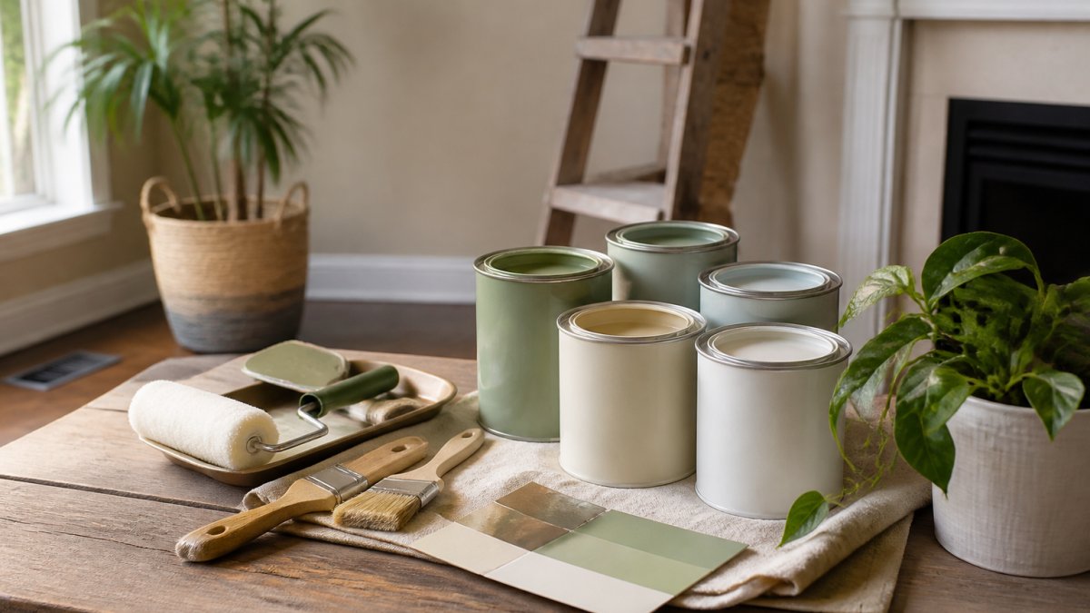
Sage green has emerged as the standout color trend for 2026. This soft, muted green carries earthy undertones that feel natural and calming, it's the color of dried herbs and weathered garden stone.
Sage green works particularly well for lower cabinets paired with white or cream upper cabinets. This creates visual balance and prevents the kitchen from feeling too heavily colored. The two-tone approach lets homeowners commit to color without overwhelming the space.
The key to sage green success is understanding its undertones. True sage leans slightly grey-green, which gives it sophistication. Some commercial "sage" shades veer too yellow-green (which can feel dated) or too blue-green (which reads cooler and more contemporary). Examine samples under your kitchen's actual lighting before committing.
Sage green pairs beautifully with warm wood countertops, light marble, or white subway tile backsplash. It's less successful with very cool grey countertops or stainless steel, which can clash with the green's warmth. If you have cool-toned materials in your kitchen, choose a sage that leans slightly cooler to create harmony.
4. Deep Olive and Hunter Green: Bold Natural Tones
Deep olive and hunter green represent the bold end of the green spectrum. These darker, more saturated shades make a statement while still feeling grounded in nature. Unlike bright or neon greens, these deeper tones carry sophistication and work in both traditional and modern kitchens.
Deep olive is the warmer of the two, it carries brown undertones that make it feel earthy and rich. Hunter green is cooler and more jewel-toned, creating a more dramatic, contemporary effect.
These colors require careful coordination. Pair deep olive or hunter green with warm metals like brass or copper hardware, and with countertops that have warm undertones (walnut, warm granite, or honey-toned wood).
Lighting matters significantly with deep greens. In kitchens with abundant natural light, these colors appear rich and inviting. In kitchens with limited light, they can feel dark or cave-like. If your kitchen faces north or has few windows, test these colors extensively before committing.
The practical advantage: deep greens hide dust, fingerprints, and minor wear better than lighter colors. They're ideal for high-traffic kitchens or rental properties where durability matters.
5. Navy and Powder Blue: Sophisticated Depth
Navy blue and powder blue represent two ends of the blue spectrum for 2026. Navy is dark, dramatic, and inherently sophisticated. Powder blue is soft, almost pastel, and feels contemporary and airy. Both work beautifully in kitchen cabinetry when paired correctly with other design elements.
Navy blue works best on full cabinetry or substantial islands. It's bold enough to define the entire kitchen and creates a sense of depth and formality. Navy pairs exceptionally well with brass hardware, warm wood countertops, and white or cream walls.
Powder blue is lighter and more forgiving. It works well on lower cabinets paired with white uppers, or on islands in open-concept kitchens. Powder blue feels fresh and contemporary without the drama of navy.
The undertone matters with both shades. Navy can lean slightly green (more traditional) or slightly purple (more contemporary). Powder blue can lean slightly grey (cooler, more modern) or slightly green (warmer, more coastal).
Both blues require attention to finish. A matte finish emphasizes the color's depth and sophistication. A satin or semi-gloss finish reflects light and makes the color feel slightly lighter and fresher.
6. Charcoal and Soft Black: Modern Drama
Charcoal and soft black represent the darkest end of the 2026 cabinet color spectrum. These near-black shades create dramatic, contemporary kitchens that feel bold and intentional. Unlike true black, which can feel harsh, charcoal and soft black carry subtle warmth and depth.
Charcoal is slightly lighter than soft black and often carries grey undertones. It's less extreme than true black but still creates significant visual impact.
Dark cabinetry works best in kitchens with ample lighting and adequate counter and wall space to break up the visual weight. A kitchen with charcoal cabinets, charcoal walls, and dark countertops will feel like a cave.
These colors require excellent cabinet preparation and finishing. Any imperfection in prep work becomes visible under the magnifying glass of dark paint. Dust, brush marks, and uneven coverage show dramatically on charcoal and black. Professional application matters more with these colors than with lighter shades.
The advantage: dark cabinets hide wear, fingerprints, and dust exceptionally well. They're practical for high-use kitchens and require less frequent cleaning than light colors. They also photograph well in professional settings and create a premium aesthetic that increases perceived home value.
7. Warm Terracotta and Earthy Tones: Comfort and Character
Warm terracotta and earthy tones bring warmth and character to kitchen cabinetry. These colors, rust, warm brown, muddy terracotta, and muted ochre, feel grounded and inviting. They're less trendy than greens or blues but offer timeless appeal and create kitchens that feel established and comfortable rather than fashionable.
Terracotta and earthy tones work best in kitchens with warm lighting (incandescent or warm LED) and warm-toned materials like wood countertops, warm stone, or warm tile backsplash.
These colors carry strong undertones that demand careful coordination. Warm terracotta leans orange, so it needs hardware and accents that complement that warmth. Muted brown tones pair beautifully with brass hardware and natural wood elements.
The practical advantage: warm terracotta and earthy tones age gracefully. They don't feel trendy or dated because they're not chasing trends. A kitchen painted in warm terracotta in 2026 will still feel intentional and well-designed in 2030, whereas some trendier colors may feel dated.
These colors work exceptionally well for accent cabinetry, a kitchen island in warm terracotta with cream or white perimeter cabinets creates visual interest and personality without overwhelming the space.
2026 Kitchen Cabinet Color Trends and What's Driving Them
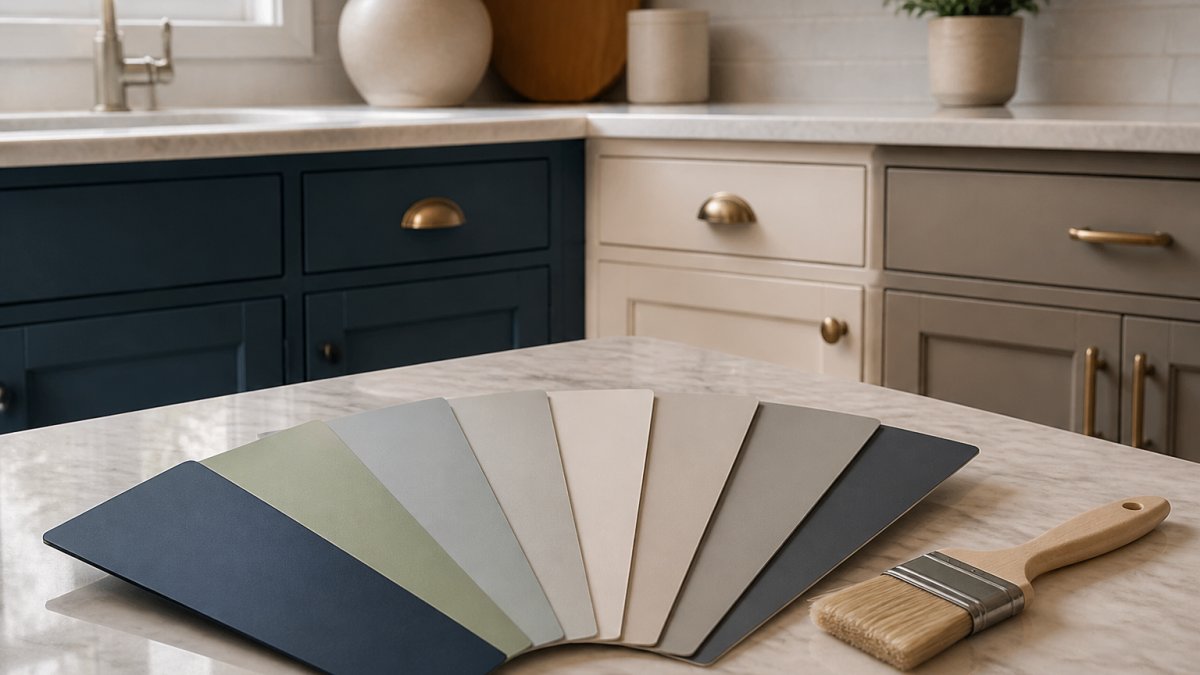
The dominant trend for 2026 is the shift toward muted, nature-inspired colors. Saturated, bold colors are giving way to softer, more grounded palettes.
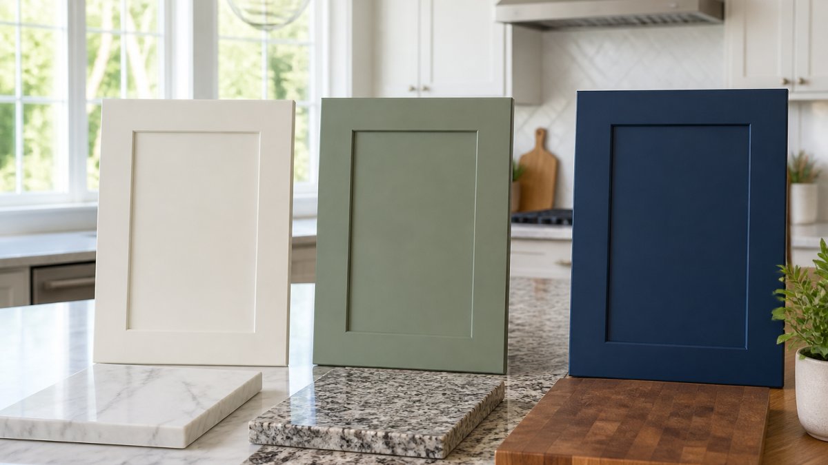
This trend reflects a broader cultural shift toward wellness and calm in home design. After years of maximalist, high-contrast interiors, homeowners are seeking kitchens that feel restful and grounding.
The two-tone cabinet trend continues to dominate.
Finish choices matter more than ever. Matte and chalky finishes are gaining ground on traditional semi-gloss. Matte finishes create a more sophisticated, contemporary aesthetic and hide imperfections better than glossy finishes.
Homeowners are investing more in cabinet preparation and professional application than ever before. Quality paint and proper surface preparation determine whether cabinet color lasts five years or fifteen.
The cabinet colors that will still look good in 2030 are those that feel timeless rather than trendy. Warm whites, greige, soft greens, and navy blues have longevity.
Choosing the right kitchen cabinet paint colors is one of the highest-impact decisions you'll make in a kitchen renovation.
The real challenge isn't choosing a color; it's ensuring that color is applied properly and lasts. When you're ready to move forward, consult professional guidance on cabinet preparation standards to ensure your project meets durability expectations. Get a free estimate and see exactly what your cabinet painting project will look like, no surprises, no hidden charges, just clear planning from start to finish.
Frequently Asked Questions
What is the most popular color for kitchen cabinets in 2026?
Warm neutrals and greige lead 2026 trends, offering versatility and longevity. Sage green and navy blue also rank highly as homeowners seek colors that blend comfort with sophistication. The most popular choice depends on your kitchen's lighting, existing finishes, and personal preference. A professional painting contractor can help you evaluate how trending colors will look in your specific space before committing to a full repaint.
How do I choose kitchen cabinet colors that work with my countertops?
Start by identifying the undertones in your countertop material. Warm countertops (granite with gold flecks, warm wood) pair well with warm whites, greige, and earthy tones. Cool countertops (quartz with gray tones, stainless steel) complement navy, charcoal, and cool greens. Visit your kitchen at different times of day to see how natural light affects both surfaces together. A free estimate from a painting professional can include color consultation to ensure your cabinet and countertop choices harmonize.
What cabinet paint finish is easiest to maintain in a busy kitchen?
Semi-gloss and high-gloss finishes are the easiest to clean because they resist moisture and staining. They wipe down quickly and resist fingerprints better than matte finishes. Satin finish offers a middle ground, providing durability with a softer appearance. Matte finishes look modern but require more careful cleaning and are more prone to showing dust and moisture marks. For kitchens with heavy use, semi-gloss is the most practical choice for long-term maintenance.
Should kitchen cabinets be lighter or darker than walls?
There's no single rule. Light cabinets with dark walls create contrast and make the kitchen feel more spacious. Dark cabinets with light walls add drama and sophistication. The best approach depends on your kitchen's size, natural light, and the mood you want to create. Smaller kitchens with limited natural light often benefit from lighter cabinets to avoid feeling cramped. Larger kitchens can carry darker cabinet colors confidently. Test your color choices in your actual kitchen lighting before painting.
How do paint undertones affect my cabinet color choice?
Undertones determine whether a color reads as warm, cool, or neutral in your space. Warm whites contain yellow or beige undertones and work well in kitchens with warm lighting or warm-toned countertops. Cool whites have gray or blue undertones and complement modern, contemporary kitchens. Greige blends warm and cool undertones, making it adaptable to many settings. Identifying undertones in paint samples by viewing them in your kitchen's actual lighting, morning, afternoon, and evening, helps you avoid color surprises after painting.